background

Sunday, June 7, 2015

Saturday, May 30, 2015

My Most Recent Addiction

I obsess. I move from obsession to obsession. Recently I discovered a hobby that hits upon so many of my sensibilities: the pocket letter.

Pocket letters appeal to the following aspects of me:

  • I like to make Artist Trading Cards (ATCs).
  • I like to share "happy mail" with those I trade with.
  • I like organization (despite what my house--and in particular, my craft room--looks like).
  • I like to meet new people and to "travel" by corresponding.


There will come a day when I feel just "eh" about pocket letters, but for now it's full steam ahead. So far I've collected and sent around 40. There are dozens of swaps already arranged for the immediate future.


Saturday, March 21, 2015

Cheapskate Angel


Imagine the chaos of Black Friday shopping. Imagine how those shoppers fight each other for items, sometimes so passionate about purchasing an item that they injure themselves or others in order to take possession of that item.

Now imagine me at my favorite thrift store. I'm usually sifting through piles of nonsense like a miner pans for gold. No one wants what I have. Other shoppers may raise an eyebrow, but they certainly won't fight me for it. 

These items are often the lowest of the low. The "as-is" stickers emblazoned on them remind this English teacher of Hester Prynne with her scarlet letter. They are untouchables. 

But I see that "as-is" sticker as a challenge. Surely that item is not useless. Surely it's not junk.

Strangely, I find myself buying things that I would never in a million years display in my home. Take folk art, for instance. Those who know me know that my tolerance of cute extends only to babies and animals. I'm kind of creeped out by Christmas decorations that include Spanish moss for hair. I'm not crazy about a face made out of a wooden bead...a face that has no face. 

So how on earth did a cute and creepy angel end up in my basket?!

That angel remained tucked among my crafty treasures, without a purpose in life until I joined a key swap. Then she got a make-over: 

 I began by removing the aforementioned moss hair and expressionless face.

 This left me with a headless angel, which wouldn't really bring much peace to my swap partner.

 I decided to cover the wings with handwriting. I photocopied a letter from a women's history book and glued that down.
 Then my dilemma was how to attach a new head.  In my junk drawer, I came across what I think was originally a metal box with a slide lid. It may have originally held lip gloss or perhaps some sort of salve. The lid worked to create a surface flush with the body. That way the head would not have a sunken or inset appearance.

I decided to use the bottom of the metal box on which to showcase a gold key. I was pleased that the rust on the metal box enhanced the copper color on the angel's sleeve.


Finally, I added the stamped image of a face. I glued the peace blocks to the body, as they were in the habit of moving and then not spelling any particular word. I decided to repurpose the silver star, which had been located on top of the original bead head. And just for a touch of whimsy, I decided to give her a halo made of a metal clock face, to which I added a tiny gold key.

Best of all, I amused myself for the low low price of 80 cents. 


Friday, February 27, 2015

Ode to the Circle

Lately, I've fallen in love with circles.There's something soothing about the repetition of that shape. I suppose that's why children love to blow bubbles. That's why they love balloons. 

I suppose that's why people can't resist skipping stones (that circular weight in the palm is so satisfying before its released). I suppose that's why a circular pizza seems more appetizing than "artisan" rectangular ones. It's probably why that dopey yellow smiley face is the mascot for the "Have a Nice Day" campaign.

Of course, the shape is feminine. It speaks of cycles: beginnings and endings--coming full circle. It's non-threatening with no hard edges. It's cellular and of the body. It's full moons, candy wafers, the ends of thread spools, clocks, and blood.


Saturday, February 21, 2015

Well-Seasoned Art

Salt and pepper are necessities at the dinner table, and one of those seasonings works well in art applications. Adding salt to a wet watercolor results in some striking patterns. Each color reacts to the salt differently. Other variables affect the end result too: amount of salt applied, what kind of salt, wetness of the watercolor, color of watercolor, and even brand of the watercolor.
 I was most pleased with these QCR watercolors. They are the most vivid, and as a result, the salt technique seems to "pop" more.
I was pleased with the unexpected color combo of the mustard-y yellow and the deep purple.
 Obviously I began to love the purple/yellow color scheme and added some hot pink and orange as well.
This final effect is much softer. You can't see where individual salt crystals were. The effect reminds me of the few times my clumsiness has resulted in spilling a drink on a shopping list. The ink moves outward, leaving no color in the middle, with the majority of the color creating a ring or stain.

Saturday, February 14, 2015

My Blue Valentine

The first year my husband and I celebrated Valentine's Day, I made him an altered book. It was actually before he was my husband--back when we were dating, boyfriend/girlfriend....whatever you call it.

The book contained 26  layouts--one for each letter of the alphabet. I matched each letter with some sort of characteristic I loved about him, or I used the letter as a trigger to write about a memory we had shared.

He went on to use the page layouts in that altered book as inspiration for one of his watercolor shows.

Several Valentine's Days have passed, and for each of those years, I felt a bit of despair that I couldn't replicate that project or go to such great lengths. It just wasn't in me--not because I didn't feel the love. Indeed, every year I have felt more love and adoration. It's just that the project sort of set the bar high and created a creative block.

Fast forward to this year. We dated for one year before he proposed to me. It was another year until we got married. And now we have been married one year and four months.

Tobe lavished Valentine's Day celebration on me the moment I got home Thursday night. He presented me with flowers and chocolate-covered strawberries. Last night, he took me out to dinner at Wild Sage.

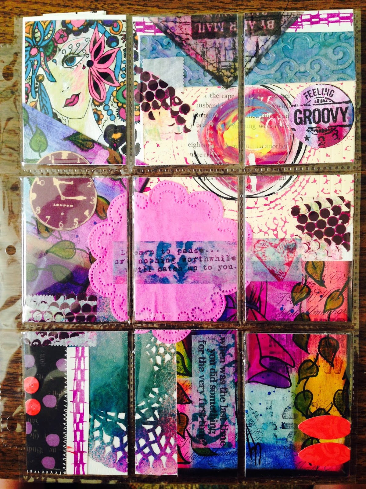
I decided to create a card that would hold gift cards for things my husband enjoys. The card idea quickly became a super-sized accordion-fold album with a carrying case. 

My intent was to create a found poem that talked about the evolution of how we came to be--who we are as a couple so far.

I set a few ground rules for myself: no hearts, no typical valentine colors, and no store-bought items--only papers I'd painted or made via some technique.
 ...and immediately I broke the rule, since there's a heart on that hand, and that woman's face comes from a vintage piece of scrapbook paper...
 Very quickly the poem started to come together. This first part reflects who I was and how I felt before Tobe.
 I had to include a vintage image from an old art textbook. I actually think this is supposed to be a dude...but let's pretend it's me ;)
 I also tried to include lots of geometric shapes, particularly circles, since Tobe's own art has been characterized lately by circle love.
 I found myself making reference to a river, which seems apt, considering that Tobe loves to fish, and we spend as many days as we can during the summer fishing.
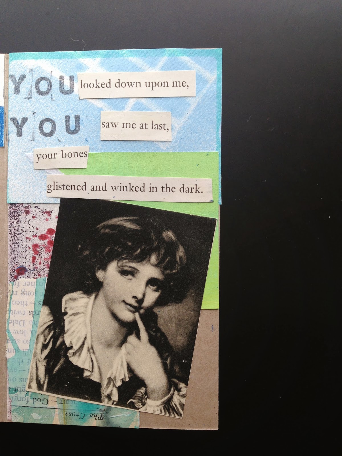
 I suppose I wanted to include a male character within these pages, so I tore this poor fellow in half. He hairline actually is pretty reminiscent of Tobe's.
 I couldn't resist getting a few clocks in...I'm a bit obsessed with them in my own projects.
 At this point, I flipped the book over and continued our story.
 I broke my "no typical Valentine fodder" rule by including a love poem.
 A couple months ago, I made some owl prints. I decided to include one here.
 I tried to make sure that there was continuity in the images and the words of the poem, so it made sense to include this motel name.
 I enjoy re-using and recycling things, so I was pleased I could include an airmail sticker and a side off a spool of ribbon.
 I wanted the poem to address the difference between storybook love and real-life. Thus, I included our animals and the fact that Tobe often sleeps in.
 And I ended the poem with the idea that I am glad these "things"--the dog, the cat, the house, my man are mine. I feel blessed.

Here's a shot of the first half of the story.
Here's a shot of the second half of the story.
 Here's the holder I made for it. I ran ribbon through grommets, and it will tie in a bow. I'm not crazy about this, but I'm unwilling to re-do it.
And finally, I glued some bags, envelopes and library card holders onto the inside. This will hold the 3 gift cards I got him. I got him cards to places that he might like to go without me.  To a stranger, this might sound cold, but it's actually practical. Because my job takes me away from him for half of every week, he's a bit of a bachelor on those days. While I try to make sure I've made some sort of dinner on our last night that will result in leftovers, I thought it would be nice if he was able to go get some beer and wings ;)

In a case of art imitating life (or vice versa), my love is still sleeping. But when he wakes, I'll present him with this gift.