background

Sunday, January 11, 2015

Remember to Floss Daily

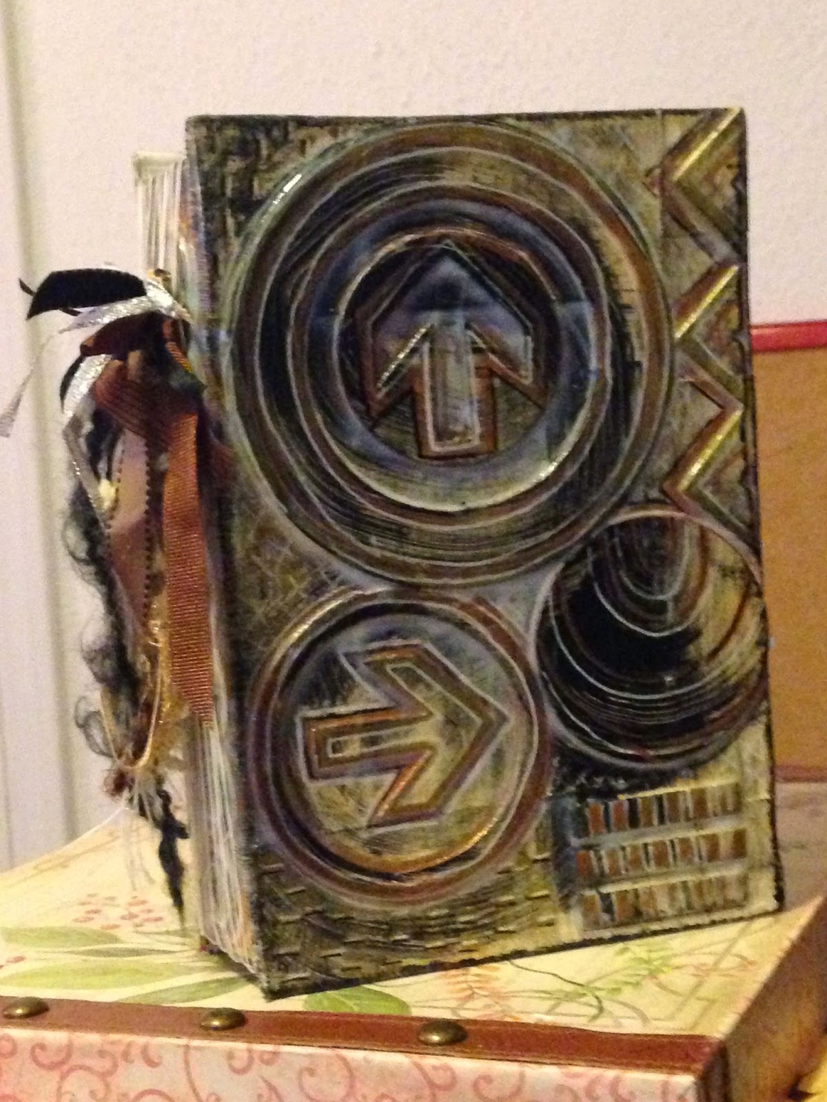
I tried a new form of book binding today. It's not an original idea. I think I watched a video awhile back by  Internet sensation, Jennibellie.  My creative process often works in delay mode. I'll see something on Pinterest or watch a Youtube video, and then months and sometimes years later, I'll apply what I learned to a project I need to get done. 

So today, after I added a packet of cocoa to my coffee, I looked at the box and thought how perfect it would be for creating a book.
 I began by cutting the flaps from the top of the box. Then cut down the seams on both sides and removing the side panels. At that point, only the bottom seam and the largest panels were left--basically a book shape.
 Next, I determined how many signatures I wanted. Signatures are inside pages. I think I had some oddball number like 16. You use as many signatures as will loosely fill the spine. The photo above shows the testing for how much space my signatures would take up. at that point, I also cut notches on the top and bottom of the spine.
 Then I covered the outside with canvas. In this case, I had some Ranger self-adhesive canvas I'd been hoarding. It comes in 8 1/2" x 11" sheets, with 5 sheets per package. I used 2 sheets.
 I wanted to make sure the spine was pretty strong, so I reinforced it with a bit of duct tape. I wish I had a more discreet color of duct tape, but all I had on hand was purple...
 Next, I added cardboard shapes to the outside of the cover. I then brushed on a coat of gesso.
 After that, I went to town. I painted several different shades of metallic gold over the shapes. I dry brushed black over the pieces to make them stand out. Finally, I used white, black, and gold pens to create patterns on the shapes.


Next I attached the signatures to the binding. This involved driving to the dollar store to buy some waxed floss, as I could not find my book binding linen anywhere. The strands of floss are tied outside the spine. 

Finally, I spruced up the floss by tying in assorted ribbons and fibers in the color scheme.

If you aren't a fan of the fibers, I can see modifying this binding by tying the floss (or book binding linen) to a sort of false spine and then gluing the false spine inside a book you've recycled. I've got many, many book covers waiting for this sort of treatment, and I intend to experiment.


Thursday, January 8, 2015

In Search of a Single Butterfly...

I joined an ATC swap with a butterfly theme, and as per usual, I can't seem to make just one. I basically grabbed the box of red scraps and went to town. The result is 11 ATCs, some that have nothing to do with butterflies. I will give my swap partner her choice and then offer the remainder to the other people in my group.


Friday, January 2, 2015

Embracing The Winter Palette

Winter has a way of bleaching what it touches. If I look out my window today, I see a pale palette: the white of snow, the straw colored vegetation, the gray of tire marks and what little cement I can see. It seemed perfect, then, that the first challenge for DLP (Documented Life Project) was to create a neutral background.

This "technique" isn't new to me. Heck, it's not new to any of the collage artists I admire most.

In fact, it's the basis of most of my work. I've long been a fan of using old books in my work. I'm also a fan of the variation in color. Book pages aren't white. They're ivory, beige, tan, ecru, and endless other shades.

I often make these sorts of backgrounds, only to cut them up into smaller pieces for use as card fronts or ATCs.

While fascinated by the process, I think I will hold off on the other part of the challenge, which is to cover over these backgrounds with gesso, paint, etc.

Instead, I think I'm going to continue with the meditation. That is, after all, what this was for me. Limiting the palette and stripping away content--the need for a focal point--allowed me to focus on texture, pattern, and simply organization. It allowed me to revel, for a moment, in the bits and pieces that I save. 

These are 8 1/2" x 11", but I think I'm going to apply the winter palette to some larger canvases to see what emerges.


Thursday, January 1, 2015

17 Owls

Lately, I've been printing by drawing on foam. I'm not sure where I got the foam. I'm not even sure of its original use. It's about 6" x 9" in size and is self-adhesive (a feature not pertinent to this process...).

The process is pretty easy. Take a ball-point pen and press hard enough to make a noticeable indent in the foam. If you're too dainty, the image won't print well.
The hardest part is actually having a design in mind. In this case, I got my design idea from a pillow featured in a Pier 1 Imports ad. As you can see, my owl is lop-sided. When I want a precise image, I will often use tracing paper or deli paper to trace an image. If you use pencil and then turn the deli paper over and go over the image again in pencil....you get a faint image transferred over on the foam. Then, of course, you need to use your ball-point pen to go over the faint image, so there's major indent in the foam.

This process also works well for abstract mark making. 

I've even used the process to make faces based on photos.
 This is my favorite of the prints, largely because of the dramatic coloring. I also began to create contrast in the prints by cutting out owl parts and adhering them to different bodies. The owl print here is red, yet the eyes, wings, tail and midsection come from a blue owl print. I also went over different areas with contrasting pens (red pen on the blue parts and blue pen over the red parts).


 I haven't done any pen work on the remaining owl prints, but you can see I cobbled them together from different Gelli print "pulls"


 I also cut some prints down to 5 x 7 size and mounted them to cards.
 This made a set of 10. I like how each owl has its own mood and personality.

I also think it's pretty great that, by using 2 Speedball ink colors, I ended up with over a dozen different colors that range anywhere from crimson to a delicate pink and all sorts of shades in-between.

Saturday, December 20, 2014

Travel Art Kit


So there's this thing that goes around on Facebook. It says something trite like, "There's really some shitty things going on in the world, and in times like these, we need a small good thing." I'm paraphrasing, of course. The next part of the Facebook message says that, within the next year, you'll send something to the first 5 people to respond to the blog post. It might be homemade. It might be something baked. It might be something purchased. You get the idea.

And in return, these schlubs agree to host a similar Pay-It-Forward-type giveaway on their Facebook page. 

I'm a sucker for that sort of thing because it feels nice to get something for free.

So five of my friends gleefully commented on my Facebook post. 

And they waited. And waited. And waited.

Long story short: I'm a procrastinating ass.

I have great intentions, and then I put things off because I've got quality standards. I don't want to just toss something out. I want to give awesome people something awesome.

So here it is December 20, and I'm just now sending out ONE of the five promised things.

This is for Nancy. I don't know Nancy from Adam. That's not quite true, but almost. I think I met her via one of the Facebook art journal groups. She may be a stranger, but damn if she isn't awesome. From what I can tell, she's bad-ass, gun-toting, former New Orleans cop, with a heart for coffee, antiques, art, and animals, particularly giant dogs. So she's a-okay in my book. Ya know?

Nancy seems to travel quite a bit, so I thought it would be neat to make her a travel journal. This travel journal began its life as a thrift store planner. You know. It's for those super anal-retentive folks who are always on time and who even plan ahead. 

Kind of ironic? Yes!

So I ripped of the faux leather and adhered music sheets to the naked cardboard. I added triangular chipboard pieces leftover from all my aqua-red wedding stuff. I didn't realize the remaining spine would be so ugly. There was residual foam. It looked pretty terrible. I entertained sewing some ribbons together like one of my favorite artists does. She makes that seem incredibly easy...and it's not.  Trust me, I tried...and cussed. 

So I had to go to plan B, which was to adhere some leftover strips of paper to hardcore double adhesive. I'm not in love with it, but it's sturdy and colorful. And it had to be done because I didn't want the poor lady to wait another year.

I thought I was done, but it seemed too simple.  That's when I decided that one of those triangles looked like the roof. To complete the house look, I adhered a postcard I made. The postcard is one of my favorites and features tons of Gelli print scraps.


 I kept the planner insides as-is. In the inside pocket, I tucked some letter stamps I got at Tuesday Morning. I love 7Gypsies. I included a water brush, a bold black Signo and a white Signo.

 Next I decided to give her a Washi wardrobe. This essentially means wrapping playing cards with the insane number of Washi tapes that I own. There's about a foot and a half of each pattern.

 I tucked these washi tapes into an envelope that I adhered to the front page of the art journal. Just so it didn't get raggedy, I coated the envelope with clear packing tape.

 I replaced the planner calendar pages with 140 lb. watercolor paper.

 On the last pages of the watercolor paper, I adhered swatches of watercolor. I placed a clear envelope in between. The clear envelope can also serve as a palette.

 Finally, I inserted a clear envelope full of bits and pieces I've made throughout the last year.

These bits didn't fit in the clear envelope, but I wanted to include them because I think they're awesome. I used a glove form and the 6-pack ring from soda to spray inks through.

Tuesday, November 25, 2014

Studying the Blues

When I get in a creative rut, my first instinct is to sort through the "grab bags"--

You see, I separate my scraps and painted papers into Ziploc baggies according to color. I randomly choose a bag and begin to paw through. By the time I'm done, I'm an admirer of that particular color, and the color suggests a mood.

This week, I chose the blue bag. I found myself drawn to the aqua and turquoise scraps. One of those scraps had the tiniest bit of hot pink. That pop of color suggested a second and third color I could pair with the aqua and turquoise.


Sunday, November 16, 2014

It Takes a Village

On Friday, I worked to complete two swaps: a "mini banner" swap and a "Home" swap. Here they are: